When Hillary Clinton released her video announcement of her presidential candidacy on Sunday, she was criticized by some as being cynical to the point that she would enlist so many permutations of what America looks like (young, old, same-sex couples, interracial, etc.) — all of whom are in a state of transition to the next stage in their lives, including Clinton herself — to appear in the video. The criticism appears to be that she can’t be everything to everybody. And it’s a criticism that I think rang hollow with most Americans.
She was also criticized for not having put forth a detailed policy agenda. (Has anybody seen the other 2016 hopefuls’ agendas? Didn’t think so.)
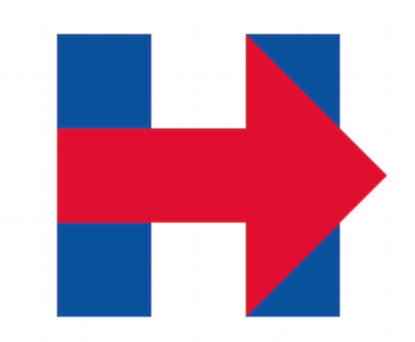
But the criticism that I thought was simultaneously silly and fascinating was over branding. Clinton’s new logo, a bright and bold “H” in red and blue, was roundly mocked by conservatives and liberals alike. Conspiracy theorists thought Hillary was invoking 9/11 through the vertical lines in the H, because they clearly signify the Twin Towers. Some thought it was a FedEx rip off. Some thought it was a messed up hospital sign. And others thought it was too boring. I guess they didn’t see her previous logo.
Did people think they would see something that wasn’t red and blue? That didn’t relate to her name? That didn’t somehow evoke an American feeling while simultaneously avoiding the patriotic imagery typically associated with Republicans?
The arrow, on the other hand, represents movement, leadership, a direction. What may be unfortunate branding is that the arrow is in Republican Red. And it is moving rightward.
(Or maybe it’s an intentional, subliminal signal to moderate Republicans.)